January 2007
High
Yield & Corporate Bonds
Kynex has expanded its security coverage to include a sizable portion of the domestic corporate bond market. Currently, Kynex has included all domestic high yield bonds in its indicative (terms and conditions) database and a significant number of liquid investment grade bonds as well. Additions and enhancements are highlighted here, but you can follow the links for additional detail and explanation.
- A “HY/Corp” tab has been added to the main Kynex blue banner. From this link, you can click to a page showing Recent New High-Yield and Corporate Issues as well as Interesting High-Yield and Corporate Issues.
- Kynex now stores valuation and risk measures for every corporate on a daily basis. This history can now be viewed.
- Advanced Search now allows you to find corporate and high-yield bonds based upon your specified criteria (terms and conditions or valuation and risk measures stored in history).
- Price/Yield/Spread analytics for a single security is located on the Kynex Corporate Detail Page. This Yield-to-Worst calculator includes numerous other measures (e.g. Spread DV01) as well.
- If you wish to examine the cash flows used during valuation, you can follow the Cash Flow link located in the left hand blue column.
- For those bonds with calls and puts, advanced
Yield-to-Worst analytics are now available. The Worst Date
Migration Analysis tool helps you identify and analyze bonds whose
spreads and durations may be “jumping” for small changes in yield. This tool identifies where the jumps
occur as well as their magnitude.
Kynex has added a new tab to its main blue banner. Clicking this tab will bring you to a page showing
you Recent New High Yield and Corporate Issues as well as Interesting
High-Yield and Corporate Issues. The
Recent New High Yield and Corporate Issues are new bonds that have come to
market within the last four weeks. For
Interesting High Yield and Corporate issues, we look for bonds that have had a
spread change of 10 percent either way, or bonds whose stock price is within
0.5 percent of a 52 week High or Low, or bonds whose week-over-week stock
movement is at least 10 percent. The
tables will give you a quick glance of the bonds’ terms and valuation
measures. For a comprehensive analysis
of the bond just left click on the specific bond and go to the Corporate
Details Page.
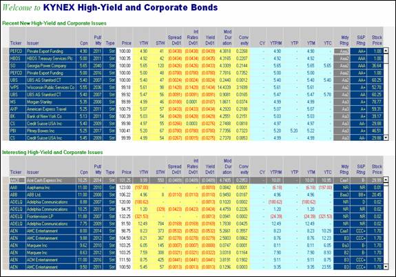
If you wish, you can sort on any column by just (left) clicking on the column name.
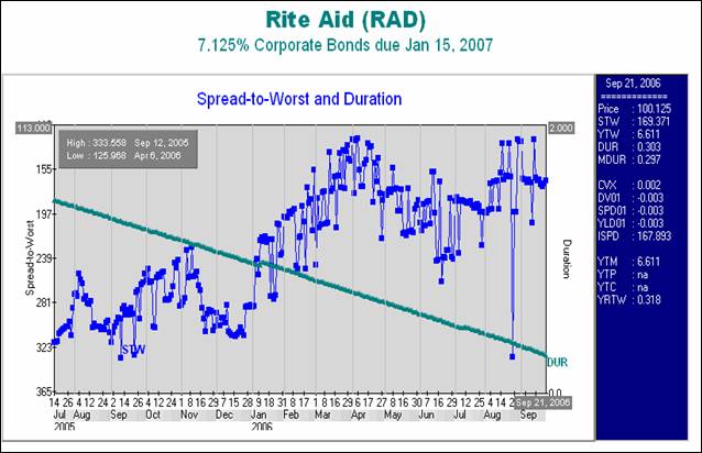
Kynex
now stores historical valuation measures for every corporate bond in our
system. On the left hand side of the
Corporate Details Page you will find a link to the History. The history page will chart Spread to Worst
and Duration, Spread to Worst and Years to Worst, and Spread to Worst and Yield
to Worst. You can put your mouse inside
the interactive chart on a particular day and the chart will display the
securities valuation measures in the right column.
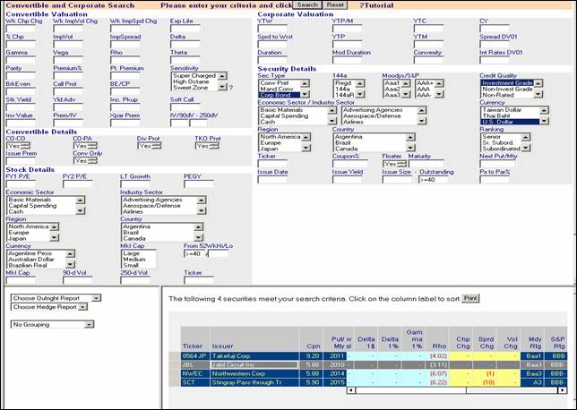
Kynex Advanced Search allows you to identify bonds with certain characteristics that you specify. You can simultaneously specify valuation parameters (e.g. yield or spread), terms and
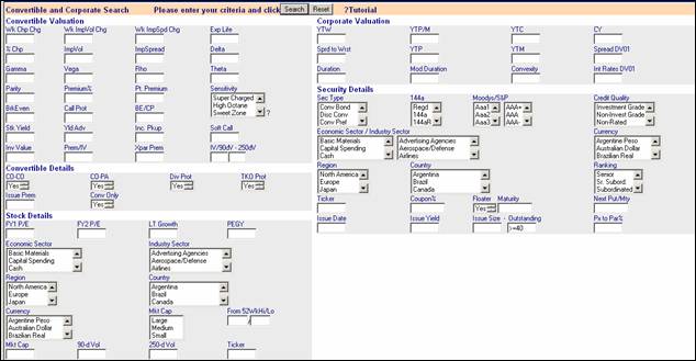
conditions (e.g. coupon, call protection) and corresponding stock characteristics. For example, suppose you are interested in dollar denominated investment grade corporate bonds whose stock price has deteriorated by 40% or more from its 52 week high. The following filter gives the desired set of bonds.
The
Corporate Details Page calculates various price/yield/spread measures for a
specified bond or preferred stock. As an
example, consider the Rite Aid (RAD) 8.125% corporate bond maturing on
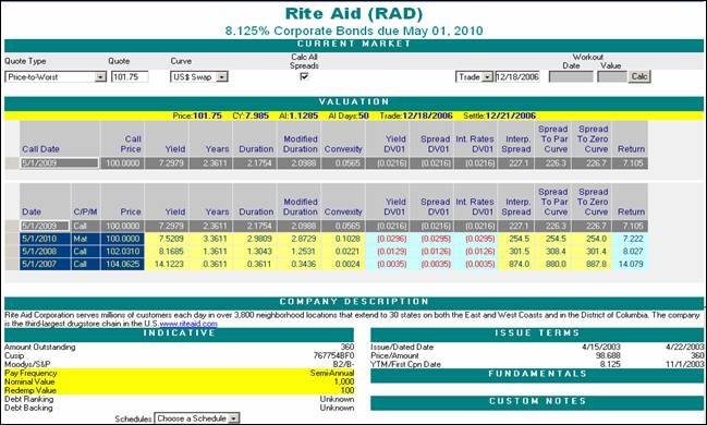
The
Corporate Details Page defaults to a “Price-to-Worst”
quote type. Other quote types include:
Yield-to-Worst
Clean Price
Dirty Price
Yield-to-Workout/Maturity
Spread-to-Workout/Maturity (Interpolated
Yield Curve)
Spread-to-Workout/Maturity (Par Yield
Curve)
Spread-to-Workout/Maturity (Zero Curve)
Yield-to-next-call (call notice period
if currently callable, maturity if not callable)
Yield-to-next-put (maturity if not put)
Most
of the risk measures are self-explanatory.
It should be noted that the “Years” column gives the weighted-average
time to all future principal payments (WAL).
It reflects the day count of the security. For sinkers, the Years value
will be less than the number of years until maturity or workout. The SpreadDV01
value will always be equal to the IntRatesDV01 for non-floaters. For floaters,
the IntRatesDV01 also reflects the change in future projected coupon rates
based upon implied forward rates.
Therefore, the IntRatesDV01 can actually become positive for longer
floaters. When the yield curve is
steeper, the IntRatesDV01 will also become or be more positive since the
projected forward rates will be greater.
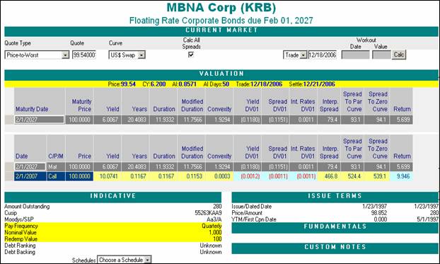
If you wish to enter a
workout date, you may do so without specifying a workout price. The workout price will be determined
from the call schedule (or the accretion schedule for an accreting bond). This feature is especially useful for
floating-accretion bonds (e.g. MER 0%
The
following graph shows the US Dollar Swap Curve as of the close of
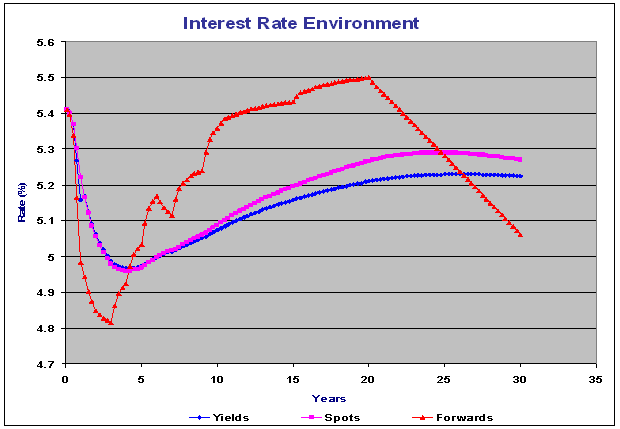
The Par Curve Spread gives the number of basis points that the yield curve (blue curve in the above graph) would need to shift in order for the full price of the bond to equal the sum of the discounted bond flows. The Zero Curve Spread gives the number of basis points that the spot curve (purple curve in the above graph) would need to be raised in order for the full price of the bond to equal the sum of the discounted bond flows. The Interpolated Spread is based upon a single point on the par yield curve (blue curve). That point is determined from the time to workout or maturity (for sinkers, the WAL is used). Additional detail on interpolated spreads can be found in the Worst Date Migration section.
The
Return value is the percentage return from settlement until maturity or workout
assuming that future coupons are reinvested at risk-free rates from the coupon
date until maturity or workout (implied forwards are used).
Cash Flows
On
the left hand side of the Corporate Details Page you will find a link to Cash
Flows Page. Once again consider the Rite Aid (RAD) 8.125% corporate bond maturing
on
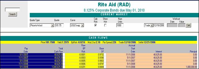
The flows are calculated to
maturity or the workout date or the worst date depending upon your other
inputs. If the “Calc Risk” flag is checked, the IntRatesDV01
is decomposed by cash flow so that you can see what each flow contributes to
the total risk. Additional information is provided for floaters. Consider the
Bank of America floater maturing on
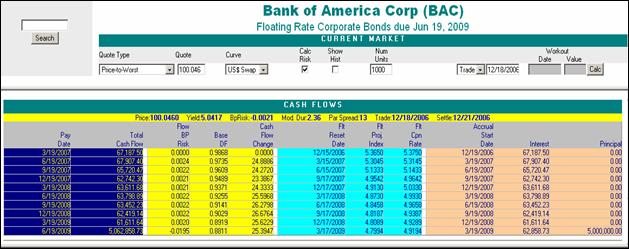
Note that the reset dates, the projected index values and the coupon rates are shown for each of the future accrual periods. For LIBOR floaters, the reset dates are usually two business days before the start of an accrual period. In this case, the minimum denomination of the bond is $5,000, so 1000 bonds have a face of $5 million. If you desire to see prior coupon fixings, you need only select “Show Hist”.
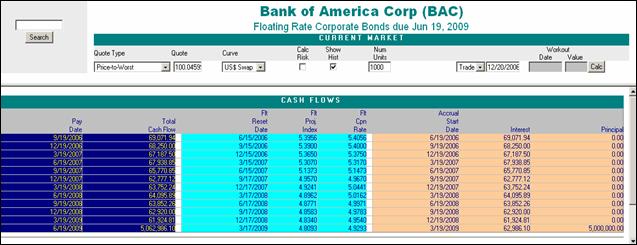
In this table, past and projected coupons are shown together.
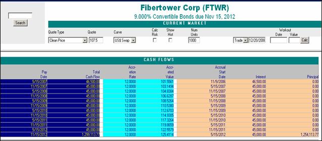
For accreting bonds, the
accretion rate and the accreted value are shown. Consider the FWTR 9%
convertible bond maturing on
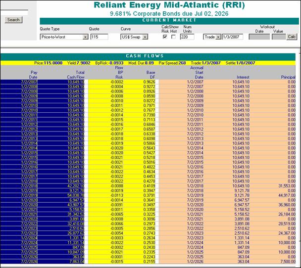
For sinkers, the principal flows are clearly shown as well as the breakdown of risk. Consider below the Reliant Energy sinker RRI 9.681% 7/2/2026.
Worst Date Migration Analysis (WDMA) is intended to identify those
price-yield points on the Yield-to-Worst curve where the worst date is changing
from one redemption date or call date to another as interest rates fluctuate. The tendency for the worst date to migrate to
earlier call dates as yields decline demonstrates the negative convexity of
callable bonds (even though the convexity of every price/yield curve
corresponding to the redemption dates is positive). As an example, we will use the Rite Aid (RAD)
8.125% corporate bond maturing on
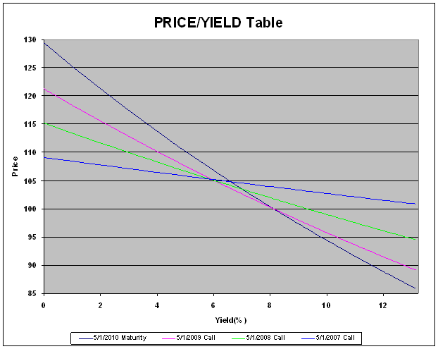
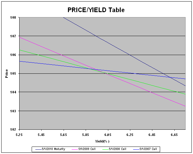
The Yield-to-Worst curve is defined as the minimum price over all of the redemption dates for a given yield (or equivalently, the minimum yield over all the redemption dates for a given price). Given a yield, the worst curve gives the lowest price. Given a price, the worst curve gives the lowest yield. If you take a closer look at the same price/yield points, you will see that every call date becomes the worst date for some yield (the arrows on the next graph indicate the worst dates). If the bond is trading at a price in the proximity of these cusp points, prices and yields will remain smooth but spreads and durations will jump (unless evaluated with an OAS model). Around these points, there is significantly more doubt about the duration of the bond. If you are segmenting a portfolio of bonds into duration buckets for risk purposes, some bonds may jump into longer buckets even as the bonds age. These jumps are not due to market movements or changes in credit worthiness. Rather, they are entirely attributable to the migration from one redemption date to another as price levels change. Spread jumps will be more severe if the benchmark curve is steeper.
![]()
![]()
![]()
![]()
Kynex identifies these points of
intersection (crossover yields and crossover prices), and then calculates the
magnitude of the spread jump and the duration jump. All
spreads are interpolated spreads. These
spreads are not just calculated by direct interpolation on the yield curve.
Rather, risk free par yields are first calculated from implied spots and
forwards (see the December
2003 Kynex Bulletin on Interest Rate
Swaps). These interpolated spreads
are numerically close to par yield spreads, but can be computed much more
quickly. It is common in the corporate
market not to use interpolated spreads.
Rather, spreads are quoted to a specific Treasury whose maturity is
close to that of the corporate bond. Although this method will not produce
these spread jumps, it does not address the issue of when to change the
benchmark security. If the benchmark security is not changed, the corporate
bond price will not track well with the Treasury. WDMA gives you the exact
price/yield when change of benchmark is prudent.
For this Rite Aid bond on
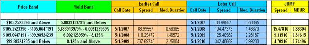
In WDMA, Kynex graphs spread
versus price, yield versus price and modified duration versus price. We make sure that the points to be graphed
include the crossover prices. Intermediate points are then sprinkled
between. At the bottom of the graph, cross over yields and prices are
shown in a table.
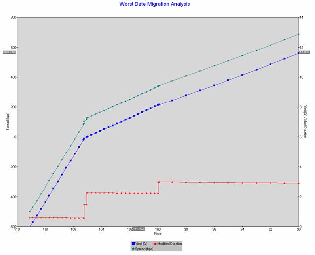
As the graph clearly shows, modified duration will lengthen as prices decrease, and the points at which it jumps are indicated by a vertical line. Since you know the price of the security, you can easily determine if the bond’s price is close to one of the crossover prices.